This is ready to show for my tutorial with Marcus Oakley tomorrow... Hopefully it'll go smoothly..
Wednesday, 5 March 2014
Work In Progress Meeting
It was quite exciting to see everyone's version of self promotion. There was such a wide range of ideas and image making. Some people only had their concept but they sounded really unique. Others had almost finished theirs and they were looking really professional. This year's projects have been good to see how everyone has developed since first year. I showed mine (only had the photoshop documents on my computer) but everyone seemed to like it and the tutors were happy, so I printed a mini version to check that it worked once cut and folded the right way. It worked! Here's a photo of the miniature 'little book of cuts':

This is ready to show for my tutorial with Marcus Oakley tomorrow... Hopefully it'll go smoothly..
Sunday, 2 March 2014
Self Promotion Progress
We've got our Work in Progress meeting tomorrow for our self promotion, I'm intrigued to see everyone else's and get their opinion on mine. I have finished making each page of my little book, and brought the pages together into two documents ready to print double sided. I wanted to add a few more pages to my book so I added another 10.5cm to the end of an A3 page. This gave me 16 page book instead of a 10 page book. Here are the two sides of paper to print:
I have also created a lino cut of Alix de Courcy Illustration and Design to go on a band around the the book. Haven't managed to colour it yet, but here is the black and white image of it:
![]() |
| These go on the reverse of each other, then cut and folded to create my book. |
| Here is the lino cut text I am going to use for my logo. |
![]() |
| Added my lino cut of an owl for the centre and brought it all together on photoshop. |
Wednesday, 26 February 2014
Real World Beckons, Portfolio Meeting and Self Promotion Starts
It's really hit home how close I am to finishing this course and being thrown into the real World the last couple of days. We had Chris Arrans' workshop 'Real World Beckons' and Portfolio Tutorials on Monday, followed by self promotion brief on Tuesday.
Real World Beckons
The workshop started with a talk on all the business and technical sides of being a freelance illustrator, and thank goodness! Because I had no idea about any of it... I truly was clueless, quite embarrassing really! But I definitely tuned in and took notes, there's a lot of things I'm going to have to learn on the go when I leave Uni. But this talk definitely let me know where to start and what to look out for.
This talk was followed by him helping us to set up our own website, something that I've been wanting to do for a while, but not been too sure where to start. He showed us some examples of past students to help us get an idea of how we should set ours up. He gave us the website moonfruit.com which is a free website design company. He showed us the basics of how to use it and then we had a go at making our own. It definitely isn't a quick process! I loaded a couple of images and then it was the end of the day.
I have an idea on how I would like my website to look but I think it's something I am going to have to do in my own time and not rush. I understand how to make one now so feel like it isn't the end of the World if this one waits until I have a bit more time on my hands. But it is exciting to start thinking about branding myself and getting myself out there. It's giving me more motivation now, more than ever.
Portfolio Meeting
I felt really happy and confident about my work after my tutorial with Jonny and Pete. I showed them work from second year and so far this year and they felt that all of it could go in my portfolio. It was a big boost to know that I have accomplished good work on this course and that my tutors have confidence in me.
They talked about how to present the work suggesting ways on how to photograph the work. For instance, for the coasters I designed to show them in a table setting. Or getting someone to hold up a print and me take a photograph. Basically just have a bit of fun with it, while still keeping it professional of course. Again, this has filled me with anticipation for the next stage of this career.
Self Promotion Starts
At the Self Promotion brief, they showed us examples of different ways to produce a self promotion piece. There were many different possibilities but I already had an idea of what I wanted to do which was a little book of lino cuts, so I used one of their example on how to fold an A3 piece of paper into a little booklet but changed it slightly to make it have more pages rather than a poster on the back.
I have already got enough lino cuts to fill it out so it's just a matter of combining the single lino cuts together to make scenes/posters, and scanning in the bigger lino cuts to shrink down to size. Then working out where each page needs to go on the A3 sheet of paper and print out double sided. Oh, and of course coming up with my brand/logo to let everyone know who I am and what I do. Hopefully planning to make a business card also but doubt I will get these printed properly in time. Here's a few pages I have already managed to develop:
Real World Beckons
The workshop started with a talk on all the business and technical sides of being a freelance illustrator, and thank goodness! Because I had no idea about any of it... I truly was clueless, quite embarrassing really! But I definitely tuned in and took notes, there's a lot of things I'm going to have to learn on the go when I leave Uni. But this talk definitely let me know where to start and what to look out for.
This talk was followed by him helping us to set up our own website, something that I've been wanting to do for a while, but not been too sure where to start. He showed us some examples of past students to help us get an idea of how we should set ours up. He gave us the website moonfruit.com which is a free website design company. He showed us the basics of how to use it and then we had a go at making our own. It definitely isn't a quick process! I loaded a couple of images and then it was the end of the day.
![]() |
| This is a screenshot of the 'website design' website and the start of me putting images in. |
I have an idea on how I would like my website to look but I think it's something I am going to have to do in my own time and not rush. I understand how to make one now so feel like it isn't the end of the World if this one waits until I have a bit more time on my hands. But it is exciting to start thinking about branding myself and getting myself out there. It's giving me more motivation now, more than ever.
Portfolio Meeting
I felt really happy and confident about my work after my tutorial with Jonny and Pete. I showed them work from second year and so far this year and they felt that all of it could go in my portfolio. It was a big boost to know that I have accomplished good work on this course and that my tutors have confidence in me.
They talked about how to present the work suggesting ways on how to photograph the work. For instance, for the coasters I designed to show them in a table setting. Or getting someone to hold up a print and me take a photograph. Basically just have a bit of fun with it, while still keeping it professional of course. Again, this has filled me with anticipation for the next stage of this career.
Self Promotion Starts
At the Self Promotion brief, they showed us examples of different ways to produce a self promotion piece. There were many different possibilities but I already had an idea of what I wanted to do which was a little book of lino cuts, so I used one of their example on how to fold an A3 piece of paper into a little booklet but changed it slightly to make it have more pages rather than a poster on the back.
I have already got enough lino cuts to fill it out so it's just a matter of combining the single lino cuts together to make scenes/posters, and scanning in the bigger lino cuts to shrink down to size. Then working out where each page needs to go on the A3 sheet of paper and print out double sided. Oh, and of course coming up with my brand/logo to let everyone know who I am and what I do. Hopefully planning to make a business card also but doubt I will get these printed properly in time. Here's a few pages I have already managed to develop:
![]() |
| This is made up of lino cut prints of a ladder and vines, wheel barrow and sack of soil. I then scanned the images into photoshop and coloured. |
![]() |
| This will be a double page spread, they are 2-colour lino and wood cut prints from my book 'The sinking of the USS Indianapolis.' |
![]() |
| I want to show the single lino cut prints I used to create bigger combined images within the book. These are copied straight from the scans, unedited. |
Saturday, 22 February 2014
A Chat with My Tutor
I spoke to Jonny on Thursday and he agreed that I was getting too swamped down by the text and that perhaps I should take it out all together. He liked the images and the mystery that came with them. And explained that perhaps it is better without text as at the time of Timothy Evans, what actually happened at 10 Rillington Place was a mystery and that it would be good for people to try to work out what happened for themselves through my use of imagery. I agreed and suggested perhaps what I should do is re-think the imagery to have one word to explain what it may be about and then at the end have the lyrics of 'The Ballad of Timothy Evans' which explains what happened to the point. I thought this would work well as the Ballad tells the events without all the smaller details while my images can tell all the smaller details that not everyone knows about. This way they compliment each other rather than tell the same story.
We also talked about how I was struggling with the book layout and he suggested that I forget about it for now, start making the images, and then the book layout can be worked in towards the end. I feel a lot better now and have a new sense of enthusiasm for the project.
He suggested putting some more symbolism within the images to hint towards Timothy's future. I have to say, I like this challenge!
I also spoke to Pete who said to reduce the title to 'The Misfortune of Timothy Evans'. It's less wordy but still has a mystery behind it.
Time to re-think some images. Can't wait to start lino/wood cutting and printing then seeing the results!
Unfortunately, it may have to wait as I've got self promotion coming up, which we have to create something which advertises our work and send to possible agents/clients. I want to create something to high standard so going to focus mainly on this for the next week. It will put me a week behind schedule but I know if I work hard, I can catch up.
Wednesday, 19 February 2014
Developing sketches and planning book layout for Timothy Evans
I've stumbled a bit here... I'm finding that developing the sketches is going well but as soon as I have tried to bring the text and the images together into book form it's not working as well or as easily as it seemed to for my last book. I think it may be because this story has a lot more 'behind the scenes' information than I initially thought, while the last book was a bit more straight forward so it was easier for me to write the text. I feel like I'm getting really bogged down by the text, and its stopping me from progressing. I think the images I am creating so far are working, and I really just want to get on with making, printing and developing the images. However, the book format also seems to be restricting me. It's time to go and speak to the tutors.
![]() |
| I rushed the text here again, and I think the title is a bit long as well. Needs to be re-drawn. |
| page 1 and 2 - The images look awkward in this layout, and the text doesn't compliment the image. Need to think how i'm going to address this problem. |
| page 3 and 4 - This double page works better than the other, but I still think the structure is prohibiting me from developing these images further. |
| page 5 - This is the last page I've drawn as I want to talk to my tutors before continuing. Again the space on this page just isn't working. The text is cutting into the page too much. |
Saturday, 15 February 2014
The start of Consolidating my Research and Initial Sketches - Timothy Evans Book
The book '10 Rillington Place' arrived through my door just in time for me to start writing the events of Timothy Evans. Its really nicely written. And luckily for me, its very methodically laid out and easy to follow. So I started at page 1. Writing down anything I felt was neccessary. There were bits I was finding out about Christie too, so I went to his section in my sketchbook and updated the research. This was a long process, as everything minute, I was stopping to write in my own words, the events that led to Timothy Evans' hanging.
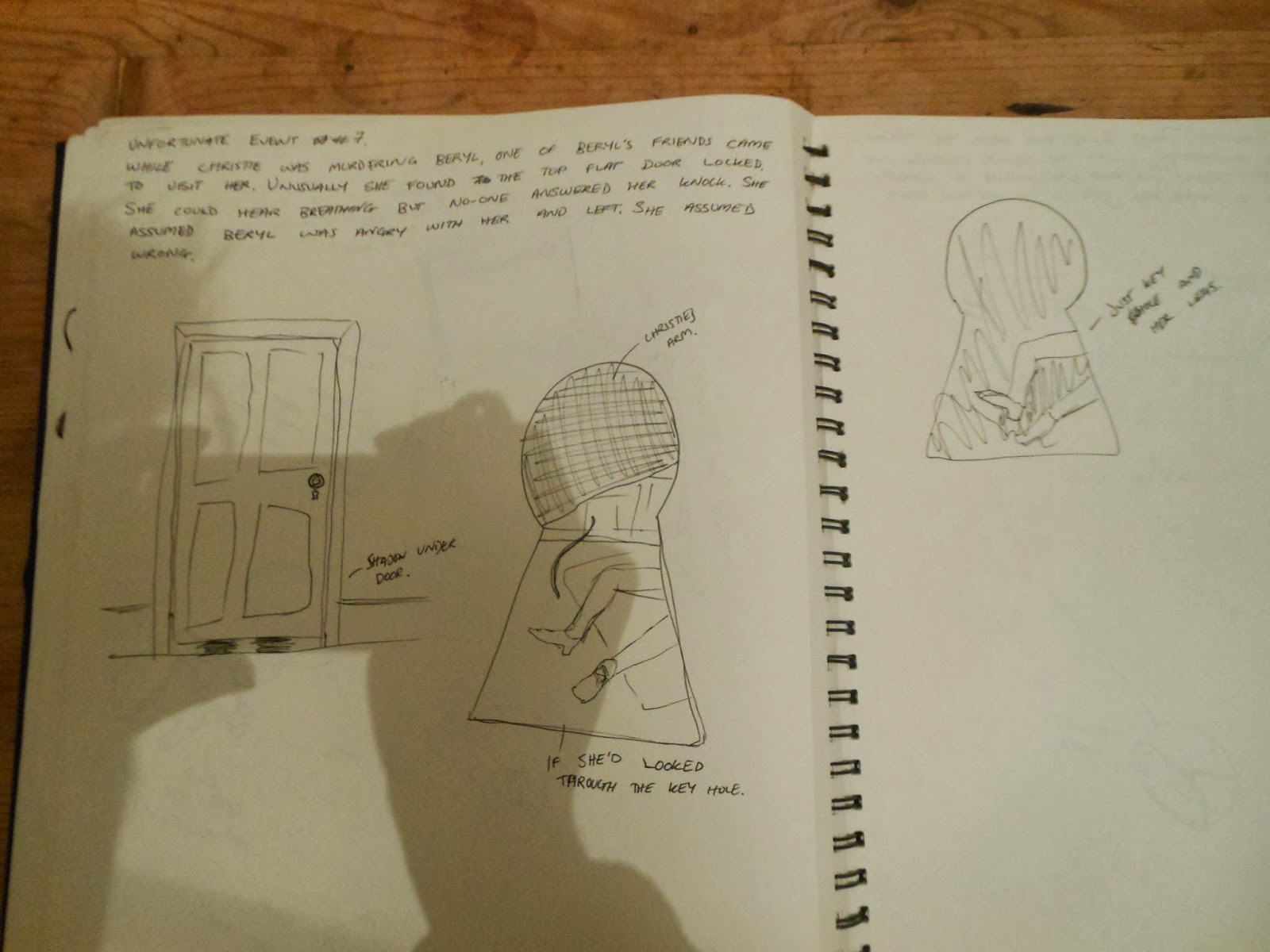
After gathering all this research, I've began to write the story, in a very basic way. I have written a paragraph of information at the top of every double page spread in my sketch book. The idea being once I have written out the story in my own words, I can go back to the beginning and begin my initial sketches. Some of the paragraphs have a sub-title 'Misfortunate Event no.' (with a number at the end depending which one it is. This is because some of the paragraphs are just about his life in general while others, i believe, are the ones which all lead to the most misfortunate event - his hanging.
The title of this book is going to be 'The Misfortunate Events of Timothy Evans'. I have created three sketches for the book cover design;
Now to start some initial sketches for each written paragraph, before going on to make a book maquette to decide on composition etc.
Here are the first 14 pages of my book in initial sketches:


After gathering all this research, I've began to write the story, in a very basic way. I have written a paragraph of information at the top of every double page spread in my sketch book. The idea being once I have written out the story in my own words, I can go back to the beginning and begin my initial sketches. Some of the paragraphs have a sub-title 'Misfortunate Event no.' (with a number at the end depending which one it is. This is because some of the paragraphs are just about his life in general while others, i believe, are the ones which all lead to the most misfortunate event - his hanging.
The title of this book is going to be 'The Misfortunate Events of Timothy Evans'. I have created three sketches for the book cover design;
| Front page design 1 - No. 10 - where it all really begins, think this should be an image within the book rather front cover. |
Now to start some initial sketches for each written paragraph, before going on to make a book maquette to decide on composition etc.
Here are the first 14 pages of my book in initial sketches:
Wednesday, 12 February 2014
The start of consolidating my research and initial sketches - John Christie character illustrations
After reading and watching documentaries of John Christie again, I have started to compile a list of words which I think relate to his personality such as (the obvious ones) liar, murderer etc. (and the not so obvious) low self esteem, attention seeking. I then looked up these words in the reverse symbolism dictionary and listed any exciting imagery that I thought could work.
After creating my symbolic reference list to look back at while creating my initial sketches, I began to look more in depth at his earlier life, his murderous life, and his arrest and conviction. Writing any main events which happened during these periods of time. Then, again, writing anymore adjectives/words and their symbols which I thought were appropriate.
| The Early Life research and symbolic reference list along with some quick sketches |
| Initial sketch - I do like the mystery behind this image but is this something that could be in the background/within an image? |
| Initial sketches - story gets lost within the image. Too abstract. I need to work out to subtly hint towards these symbols. |
| Again, I quite like the bottom right image here, but need to refine the idea and put it more in context. |
So after speaking to both Jonny and Pete Lloyd, they helped me figure out what was wrong. (It was quite obvious in the end!) The story was getting lost. I was concentrating too much on the symbolism and I'd forgotten to get the story across. Originally I was, sort of, going for this, but was hoping it would still seem relevant to the character John Christie. However, after doing the initial sketches and talking to Jonny and Pete, I realise it's just not going to work. This is not to say I'm not going to use symbolism in these images. I just need to illustrate the story and then find a way to work the symbols into the illustrations. So the research hasn't been a waste of time. And at least now I know what I need to aim for. Its going to have to be back to the drawing board for these images! And thanks to Jonny I have three books he's lent me which are going to help;
| This book is where all my text comes from. It is a book filled with posters and flyers throughout WW2. This is the same era as the story so it ensures the text is in-keeping with the time. |
First though, I think I may have a break from this bit of my FMP and begin on the book about Timothy Evans. I described my plan for this book to Jonny and Pete and they suggested I get on with it first as it's the one I'm most confident about.
Before I forget from the tutorial meeting, I've written a quick list of questions I should ask myself when I do return to the John Christie Illustrations;
Subscribe to:
Posts (Atom)